|
|
Post by Adrenaline on Dec 18, 2014 7:56:36 GMT -6
Bardock Oozaru is impressive. My only major complaint is that his snout is too large. But still very good. 9/10
Nappa is so much better than the first one. Good size and sculpting, but his head is still too small width-wise. Looks like the Scultures head. Also, even though you may have painted him navy, it looks like he has black armor. 8/10
Genome is cool! He's not a real character in the series because he's from Dragonball Heroes, but cool nonetheless. I think he's too blue and maybe a little too tall, but the concept is really nice. 8.5/10
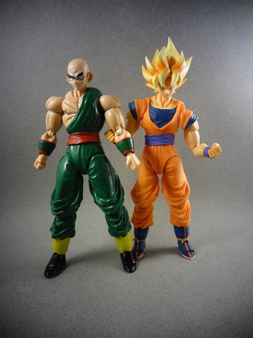
Tien is an improvement too. I think his muscles are fine, but his shoulders should be bigger. That's probably what's throwing gotenks off. The eyes look a little rushed, but I still like him enough. 7.5/10
|
|
|
|
Post by Branjita on Dec 18, 2014 12:06:42 GMT -6
The Oozaru has quite a big nose, but that's a hard sculpt to have to do. I have the figure you made it from, and I still haven't started it. I really like the Nappa, but I think his neck should be more muscled so he'd look a bit more proper. The head should probably be bigger, perhaps DWC Nappa's head, but the neck should be larger to compensate for how big the rest of the body is. The only thing I would criticize about him is his toes, I don't like how chunky they are. I think they are a bit too thick in clay. Still, I like him enough that I saved the pics to my computer  . I don't know who Genome is, but I like the way he looks. Also saved the pics. Tien's eyes look a bit unrefined, but I sure do like the rest. I saved the pics. Just as a general tip from one customizer to the other, I would still like to see you work a bit more on muscles on future figures. The bicep on Tien's arms should look a bit more like the SS Goku's standing next to him. You gotta get the bulge a little more refined so it looks perfect from the angle this pic was taken.   I'm not sure if you sculpted the biceps on Zarbon, but his were great. You should reference Nappa's big muscular arms when sculpting since they have good, exaggerated musculature. That way you can figure out how to do nice looking upper arms consistently.  I'm not perfect at it myself, as it takes some skill, but I bet you can do it! |
|
|
|
Post by Deleted on Dec 18, 2014 20:24:18 GMT -6
gotenks I see what you mean. It was sculpted around goku so he's a little bigger. I didn't wanna make him to big. Adrenaline yes I agree the head sculpt was to large. I really couldn't do anything after I did it. So I tried to disguise it. Yeah I know about Nappas head it looks small in photos but it fits really well in person. Nappa I painted black. I kept seeing him in navel and black. I figured it really wouldn't matter to much just becaus there are times when it's black. Genome is a concept adult form. I was talking to someone about him. They said I should make him into a adult. So cell body would work. Tien. I'll agree. I just didn't wanna make him to big. Branjita basically the same thing as adrenaline . But yeah I'm still trying to get my biceps better.but aye I'm improving. Oh and thanks for saving the pics
|
|
|
|
Post by timone317 on Dec 18, 2014 22:17:25 GMT -6
whoa...I never saw that Zarbon...very impressive. compared to the last one...man...that's a big step up. Hmm...! I see a Zangief Nappa...how awesome, I figured I'd never see that idea utilized. Sadly I think it's a tad too tall but it's still very nice. but...uh...the armor seems a little puffy. the Oozaru seems like it was painful to make...but then again maybe bigger figures are easier to paint? augh...hate to say it but the snout is impossible to ignore. It might not matter now that the custom is done but I suggest you try this while sculpting (something I've never done myself but am going to try, I must admit my sculpting isn't the best in the world). Find images of the character from every angle (or just one angle you happen to need), print it out, and keep the image close by while you sculpt so you can hover the figure over the image and determine whether or not you have the right size. Think of it like this, you're trying to fill in the blank spaces with the sculpt.  no idea if it will actually help or not but it seems like it's worth trying. |
|
|
|
Post by Branjita on Dec 19, 2014 9:32:04 GMT -6
That's a really good reference pic of Oozaru. I print pics of characters I'm sculpting and painting. It's super useful. Sometimes I just try to reference pics on my phone, but it's so inconvenient.
|
|
|
|
Post by Deleted on Dec 20, 2014 7:56:21 GMT -6
Thanks for the help guys
|
|
|
|
Post by doraemonizuka on Dec 21, 2014 10:22:20 GMT -6
nappa is so coool! but the head looks like he's dehydrated...but still looks impressive
|
|
|
|
Post by Deleted on Jan 5, 2015 1:39:06 GMT -6
Thanks dude. I agree it it too small
|
|
|
|
Post by Deleted on Jan 5, 2015 1:46:30 GMT -6
|
|
|
|
Post by Deleted on Jan 5, 2015 1:47:52 GMT -6
Just realized I have the camra tilted. Sorry about that
|
|
|
|
Post by ◄VR► on Jan 5, 2015 1:51:28 GMT -6
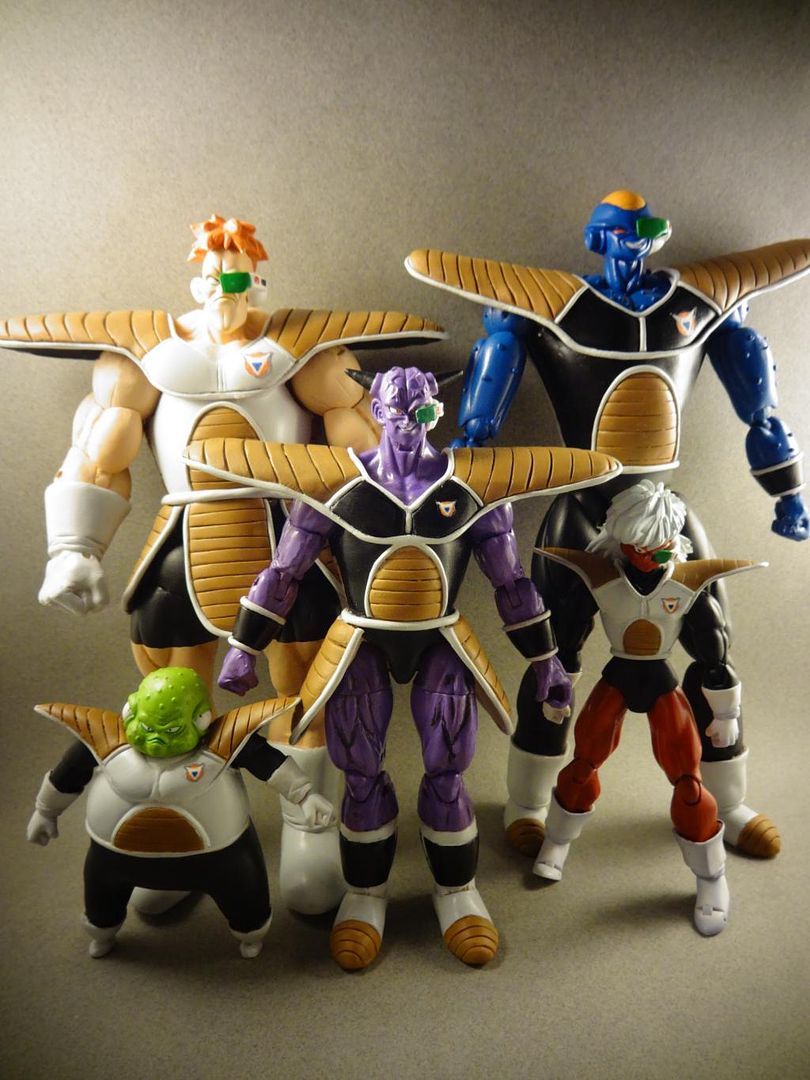
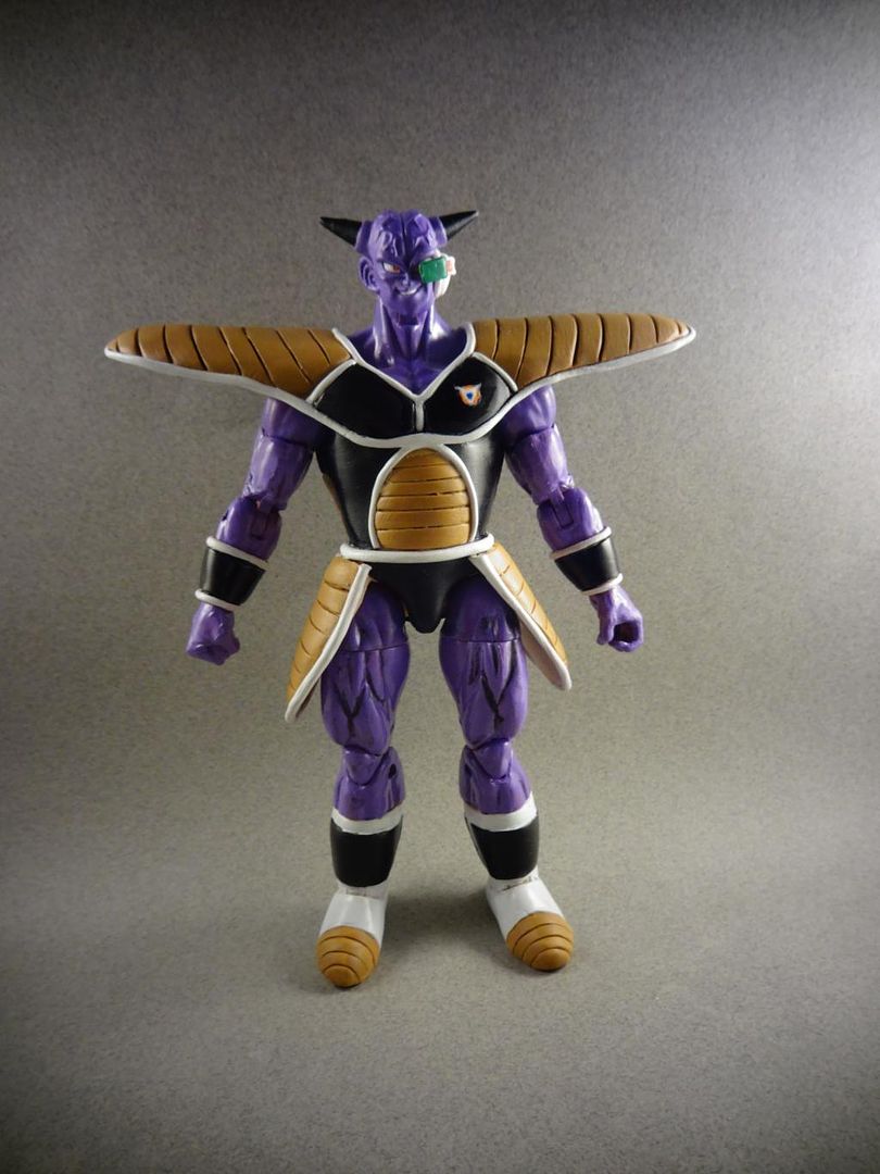
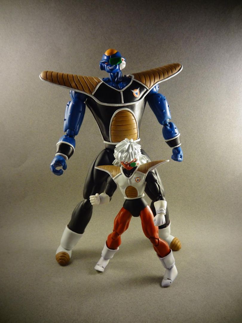
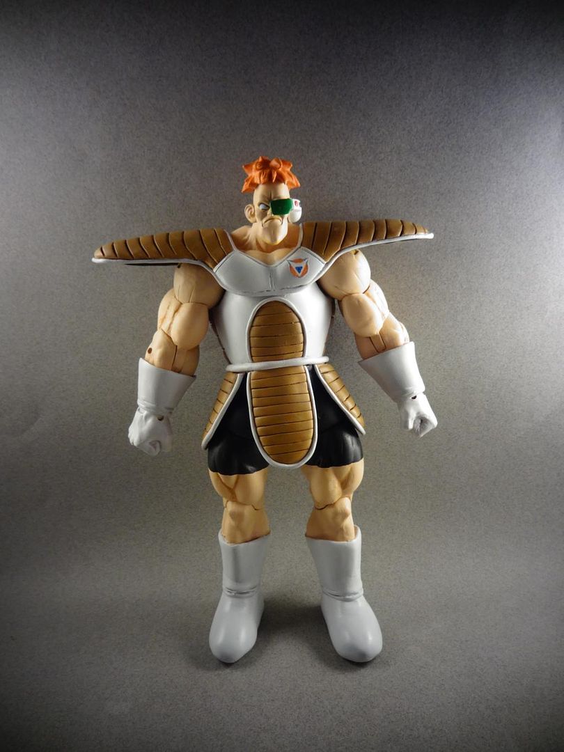
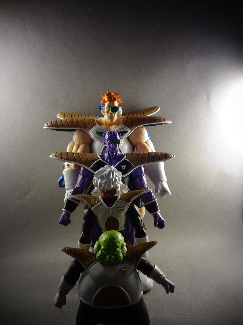
Those are pretty good. Ginyu's, Recoome's & Burter's shoulder pads might be a bit too long, but I don't see many other issues other than that. Either way, it's nice to see some customs of The Ginyu Force. TOKUSENTAI!!!!  |
|
|
|
Post by Deleted on Jan 5, 2015 2:00:45 GMT -6
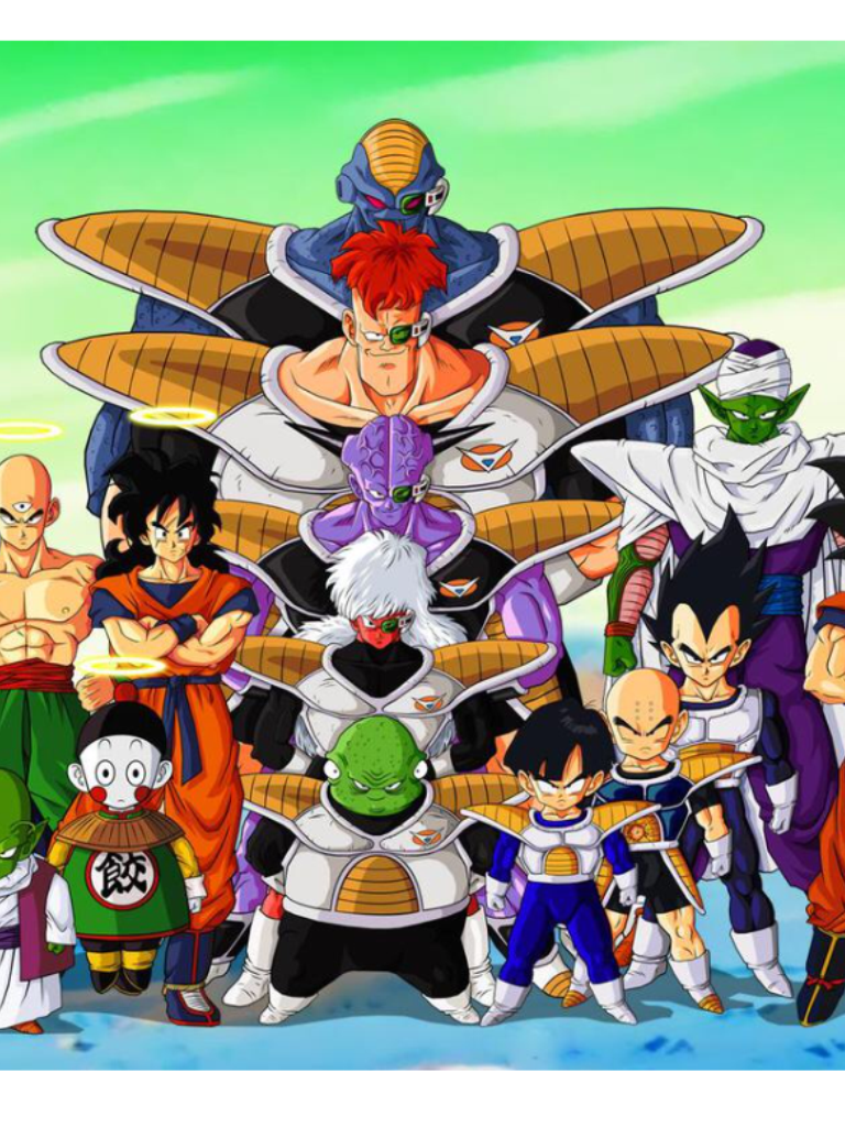
I see I guess I was just using this as a ref pic  |
|
|
|
Post by roshisurprise on Jan 5, 2015 2:04:13 GMT -6
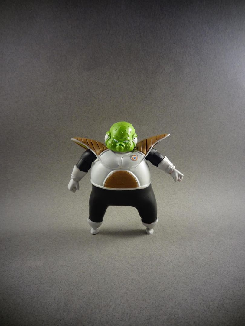
Really Nice!! My only remarks are on recoom's shoes being a bit undetailed and his chest pad being a bit too narrow. Other than that I think they're soo cool! Now give us some poses  |
|
|
|
Post by Deleted on Jan 5, 2015 2:07:14 GMT -6
Lol too tired. Thanks for the input
|
|
|
|
Post by cleve5sp on Jan 5, 2015 10:31:53 GMT -6
Awesome 1andonly5711. You continue to amaze with your clean customs and your own style. Keep it up man! |
|


 .
. 
