|
|
Post by timone317 on Mar 9, 2014 2:25:05 GMT -6
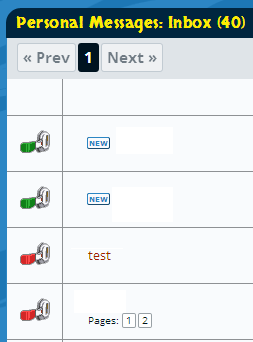
just for confirmation...  kind of bugs me...every other site on the net has made red the unofficial color for new updates. just think it'd be cool if that also applied here. |
|
|
|
Post by CyHi on Mar 9, 2014 2:36:35 GMT -6
I think using both green and red could be the confusing part, as either of them could work fine.
|
|
|
|
Post by Branjita on Mar 9, 2014 8:29:24 GMT -6
I don't see how it really matters. It's just something to be cute, the word "new" does its job.
|
|
|
|
Post by king on Mar 9, 2014 8:33:57 GMT -6
well its kinda matters a bit because Red is an alarming/alert color so you feel the need to check where as green is calm and passive and tends to be ignored (probably another reason why namekians are green [passiveness])
|
|
|
|
Post by Branjita on Mar 9, 2014 9:41:21 GMT -6
I can switch them, it doesn't matter to me.
|
|
|
|
Post by Branjita on Mar 11, 2014 12:12:52 GMT -6
I just made a major change to the programming to help phone and tablet users who were getting frustrated (okay, maybe it was just me, but that was enough!!!) that they'd go to click a breadcrumb navigation link or click a thread and end up going the wrong place (banner ad... wrong topic/thread...). So I added a lot more space to help with this accuracy.
Also, got tired of how hard it was to click the yellow navigation links accurately, so I added some more space... it's not as attractive now, but you'll appreciate the accuracy/usability.... Did the same to your profile pages so you can finally click the Notification tab without issue. These changes may negatively impact other things, so if you notice a problem let me know.
If I could change the Profile link to go directly to Notifications I would, but you could say ProBoards has it "hard-wired" to not do that, so I can't change it.
|
|
|
|
Post by Deleted on Mar 11, 2014 15:41:01 GMT -6
It looks a little weird all links spread out like that but it is definitely easier to select the right one now.
|
|
|
|
Post by Branjita on Mar 11, 2014 17:13:20 GMT -6
Looks weird, but it sure is a lot easier. It only affects phones--I forgot to mention that earlier.
|
|


